Due to low user retention, iPoop—a social media app for tracking poop—was in need of a clean up. It was time for an update to the UX and UI.
Why?
Even with the thousands of downloads and positive reviews on the App Store, the stickiness and app performance could use improvement, and the screens require a lot more user experience consideration.

App Store ratings for original version of iPoop.
Screens from original version of iPoop.
User activity and retention analytics from original version of iPoop.
Overview of project plan.Where did I come in?
I was invited to redesign (branding, UX, and UI) the app completely, so I organized a plan on how to approach the project.

How did I get started?
To get a better understanding of how to improve iPoop, I took a look at the existing UX and UI, and also downloaded their competitor for a competitor analysis.
Review of existing UI and competitor app.How were users involved?
Many users have suggested features and improvements. After sorting user feedback, I looked into other apps as inspiration with functionalities that match their requests.
-
“How do I get the trophies?”
It wasn’t made clear how to earn trophies. Users want trophies taken to the next level.
-
“It’s impossible to find anyone!”
Searching for friends wasn’t behaving the way people were expecting.
-
“I want to know when a fellow iPooper is using the app.”
-
“If I pay for Premium, I want more from it”.
Examples of inspiration. 
Sample of the design system.What was next?
After creating the new branding, I built a design system that would help maintain consistency throughout the app.
-
![]()
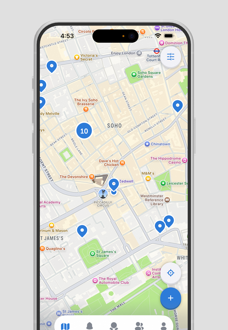
Clean and simple toilet map view.
-
![]()
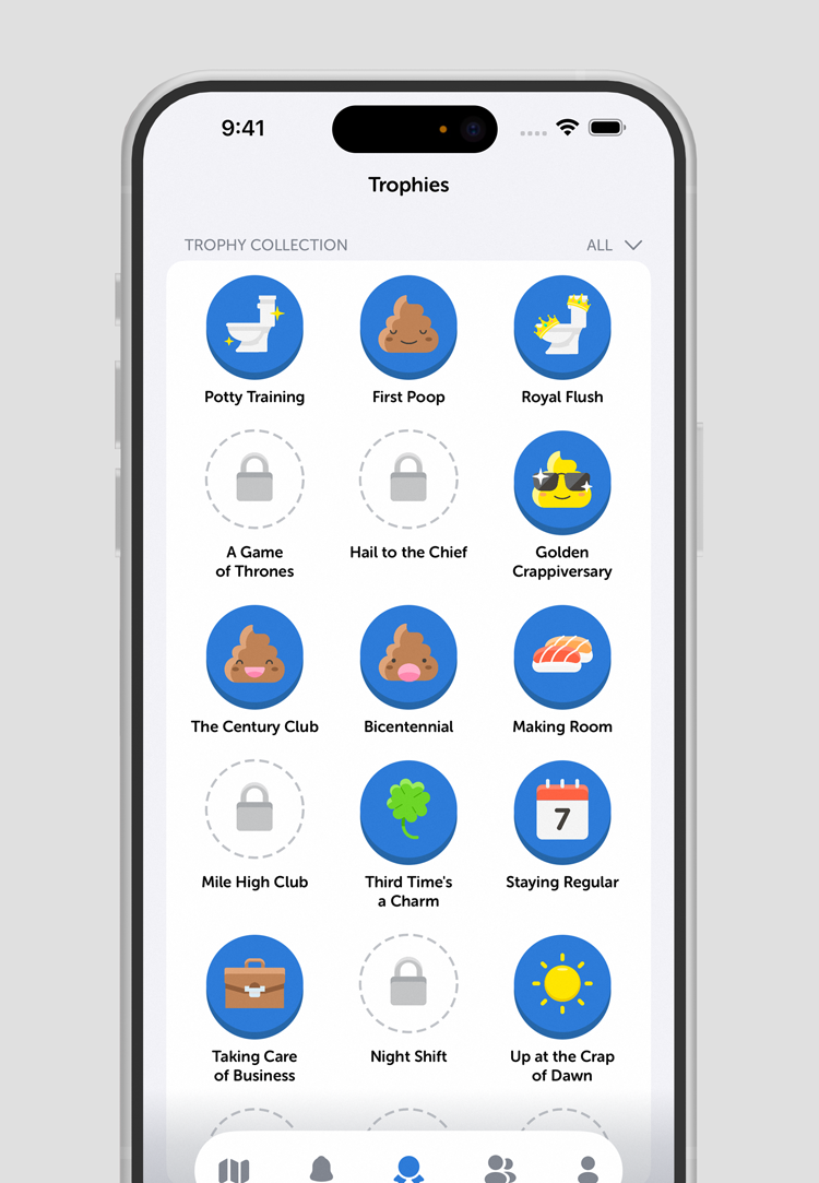
New trophies for more engagement.
-
![]()
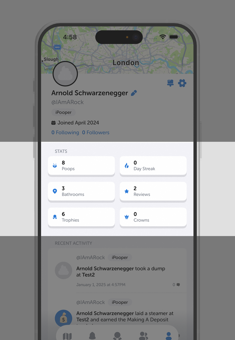
Key statistics displayed on profile.
-
![]()
Playful and dynamic error/empty states.
-
![]()
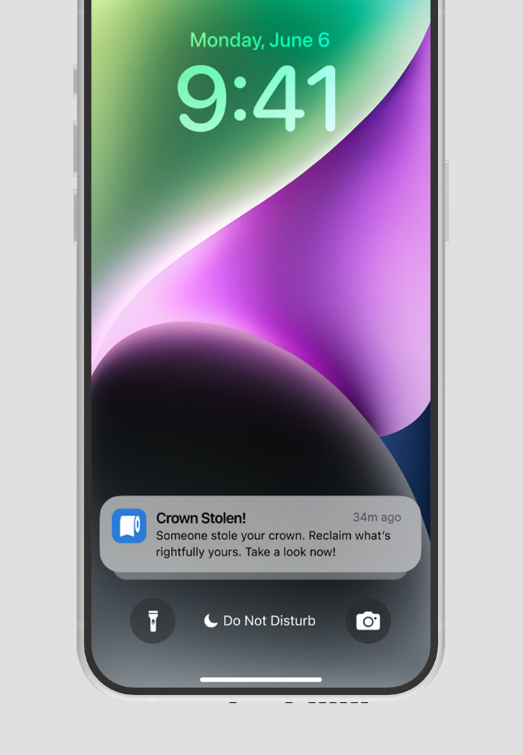
Notifications to alert users of activities.
-
![]()
More competition for community building.
-
![]()
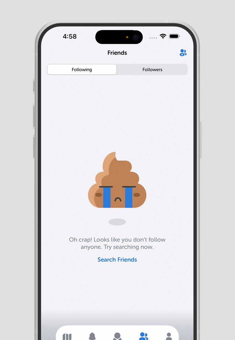
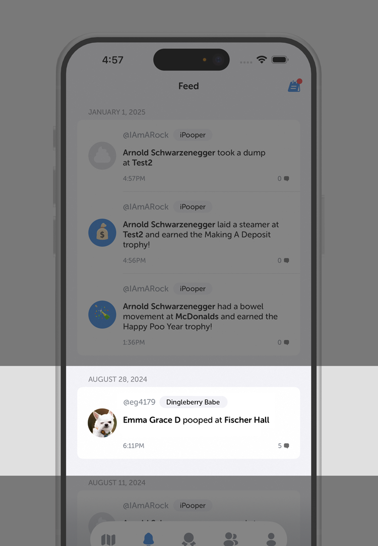
Keep tabs on your potty pals.

What about usability testing?
TestFlight was used for usability testing when the MVP. There was a great amount of insights shared.
-
Device: Mobile
Summary: After viewing the app with a number of empty states, it became clear that the illustrations used felt more like error states. This is not how we want the users to feel when quickly glancing.
Insights: When working with empty states, it’s important to ensure there is a purpose. Each empty state has to be intentional with a potential call-to-action.
-
Device: Mobile
Summary: It was enlightening seeing the user navigate through all the screens and tapping on everything. It became very clear there was some feedback missing from buttons within the app.
Insights: Even if the app is in an MVP stage, we need to ensure it is clear to the user what items are coming soon or in development, rather than making it seem like it’s a usable function with no information.
-
Device: Mobile
Summary: After completing the initial onboarding, the user is brought to the Map tab with no instructions. She felt like she needed a simple tutorial to help navigate through the first few steps of the app.
Insights: As much as people want to explore on their own, it’s necessary to add in a short set of instructions that people can breeze through to get the jist of what to do.


What results am I hoping for?
With the addition of notifications, finding friends easier, enhanced trophies, and more value to iPoop Premium, there is a huge increase to active session time, user activity, user retention, and subscriptions.


What did I learn?
There were a lot of new problems to solve, and an equal amount of learnings from it.
-
Although social media is a great way to connect with friends and family, it’s important to consider the fact that they pose some serious safety concerns. We made sure to implement privacy features so teens and women felt comfortable using the app.
-
Working on a large app like social media platform means more room for error and empty states. This was important for me to understand how to best approach these design problems.
-
Working with animations was new for me. It’s amazing how an app can come to life with simple gestures like animations. The surprise and delight encourages regular use of the app.
-
I thought the app would attract more men, but it appears women enjoy the experience just as much, so I had to make sure the UI was balanced.